Top 7 Financial Website Design Trends and Inspiration Going Into 2021

In 2020 and beyond, your financial institution’s website should be an indispensable part of your credit union’s growth plan. From new member acquisition to increasing products per existing members, a website acts as an extension of your branches and customer service phone lines. As the adoption of digital services grows even further thanks to behavioral shifts following the coronavirus pandemic, it’s more important now than ever that your website best-represents your institution while maintaining a modern, future-forward look and feel.
“Consumers in the financial space gravitate towards compelling graphics, video and showing fundamental information like special promotions, products, and services in a clear, easy-to-read format.”
Cheryl Parker, Director of Client Services at evok advertising
As we wrap up 2020 and head into 2021, here’s what financial brands can expect to see emerge or continue to rule web design trends to create a more engaging user experience.
Accessibility & ADA Compliance
If there’s one thing to take away from this article, it’s that your website needs to be ADA compliant and built with accessibility in mind. The Americans with Disabilities Act ensures that all users can navigate and interact with your site regardless of abilities. Failure to ensure your site meets those needs could lead to lawsuits and hefty fines.
While there is no official list of ADA compliance standards, most designers suggest following the World Wide Web Consortium’s Web Content Accessibility Guidelines (WCAG). These include providing text alternatives for any non-text elements, making all functionality available from a keyboard, and ensuring all content is readable and understandable.
Dark Mode

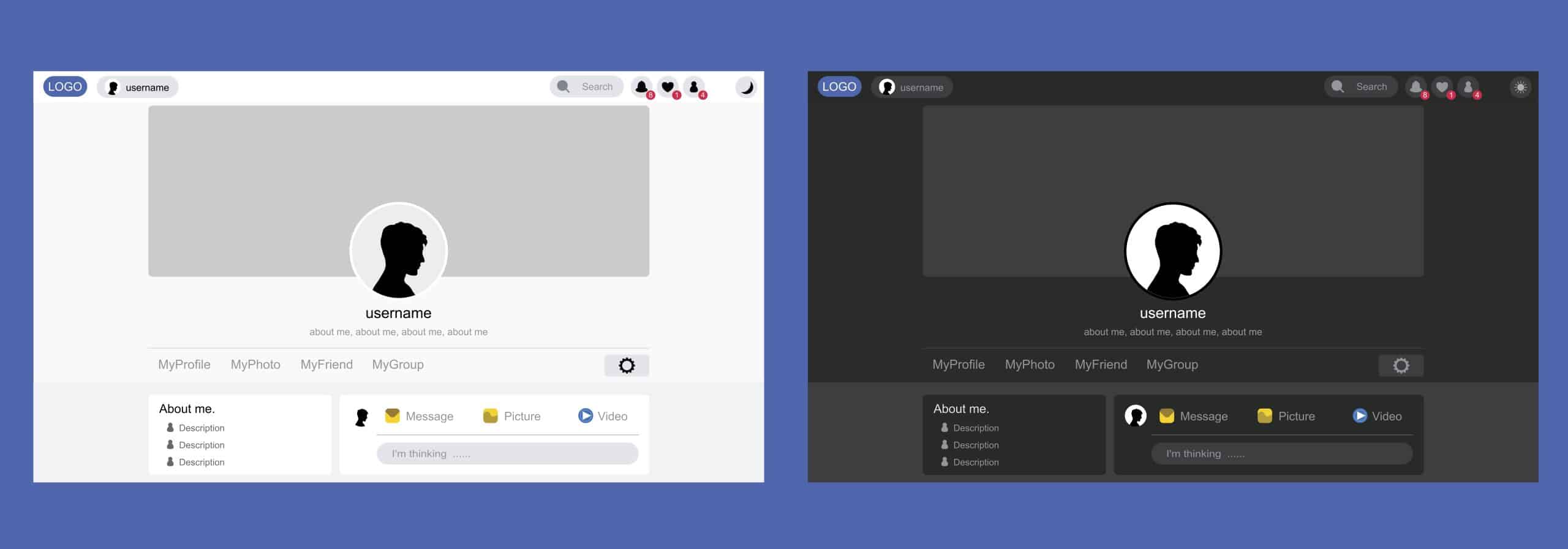
Dark mode, which uses light-colored text, icons, and other design elements on a dark or black background, has surged in popularity in recent years. Apple, Google, Facebook, and other tech giants have launched optional dark modes within their applications, and we can expect more of the digital world to follow suit through 2021. To incorporate this trend into your website or digital banking applications, credit unions can allow users to choose between light and dark color schemes, or simply design your applications with darker backgrounds and lighter text elements.
Personalized Content
Personalization is and will remain the expectation for consumers when it comes to advertising in the 2020s. Whether it’s a “Good morning, John,” noting the time of day and member’s name at login, or product recommendations based on a user’s interests, browsing history, and more, marketers can drill down deeper than ever before to craft highly customized brand experiences.
On your website’s homepage, personalization may look a little different. If you’re a local, regional, or state financial institution, this may be as top-level as ensuring your imagery reflects your community, whether it is by including landmarks or popular activities in your photography.

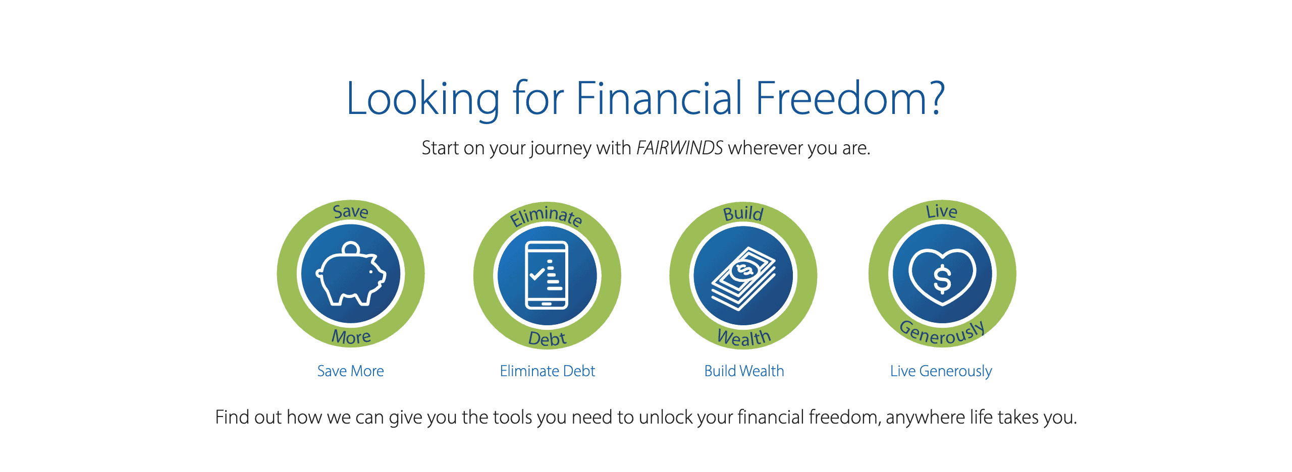
On a deeper level, you can create “paths” for users to follow once they land on your site personalized to their life stage, product needs, etc. FAIRWINDS employs this technique to help users determine which stage on the “Financial Freedom journey” they are in, and helps them along each step of the way.
Flat Design & Minimalism, Reimagined
While minimal design and flat, hand-drawn illustrations have all but become a staple in modern websites, we’re starting to see the next chapter of this trend take over. This involves white space (which may now include dark mode) and simple graphics or geometric shapes being partnered with organic, wabi-sabi inspired elements. It also means exploring beyond black, white, and tints to include unexpected color accents and gradients.

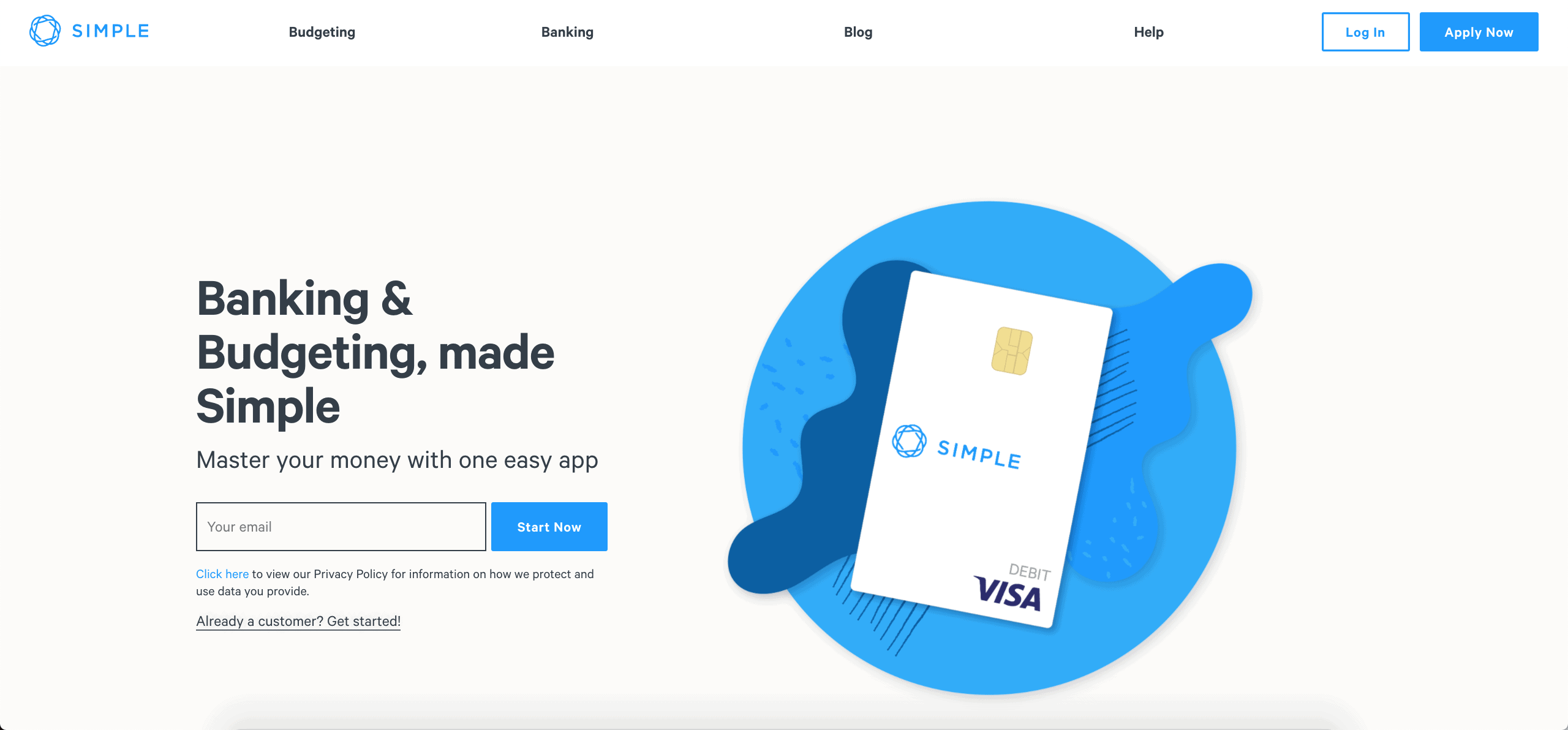
As in Simple’s website, we’re also seeing text taking over the hero section. While full-width header images still have their place in modern web design, leading with a benefit-driven copy may give financial institution’s a competitive edge when connecting with potential members.
Micro-Interactions/Animations
Web trends in 2020 and beyond are all about the details. Micro-interactions and micro-animations may be small and subtle but they pack a significant impact when it comes to a seamless yet eye-catching design. Micro-interactions, such as links changing colors on hover or small movements on clicks, guide users through your website. Micro-animations, like a credit card spinning 360 degrees to show off a unique design or the order in which elements load, add visual interest to your site while also keeping users engaged with playful, unexpected actions.
Data Visualization
For financial institutions, communicating data and information is vital to the products and services you provide your members. Whether it’s mortgage and credit card rates, or APY on savings accounts, there must be a place for facts and figures in your website and app design. This is where data visualization comes in—finding visually engaging ways to showcase key information. Consider on-brand infographics and animated videos to present important service details or product benefits.
And once you’ve invested in data visualization in the form of graphics or videos, usage doesn’t have to be limited to your website. You can extend the life and impact of these pieces by sharing them on your social channels, creating a YouTube channel or even incorporating visualization strategies into your printed promotional materials for in-branch use.
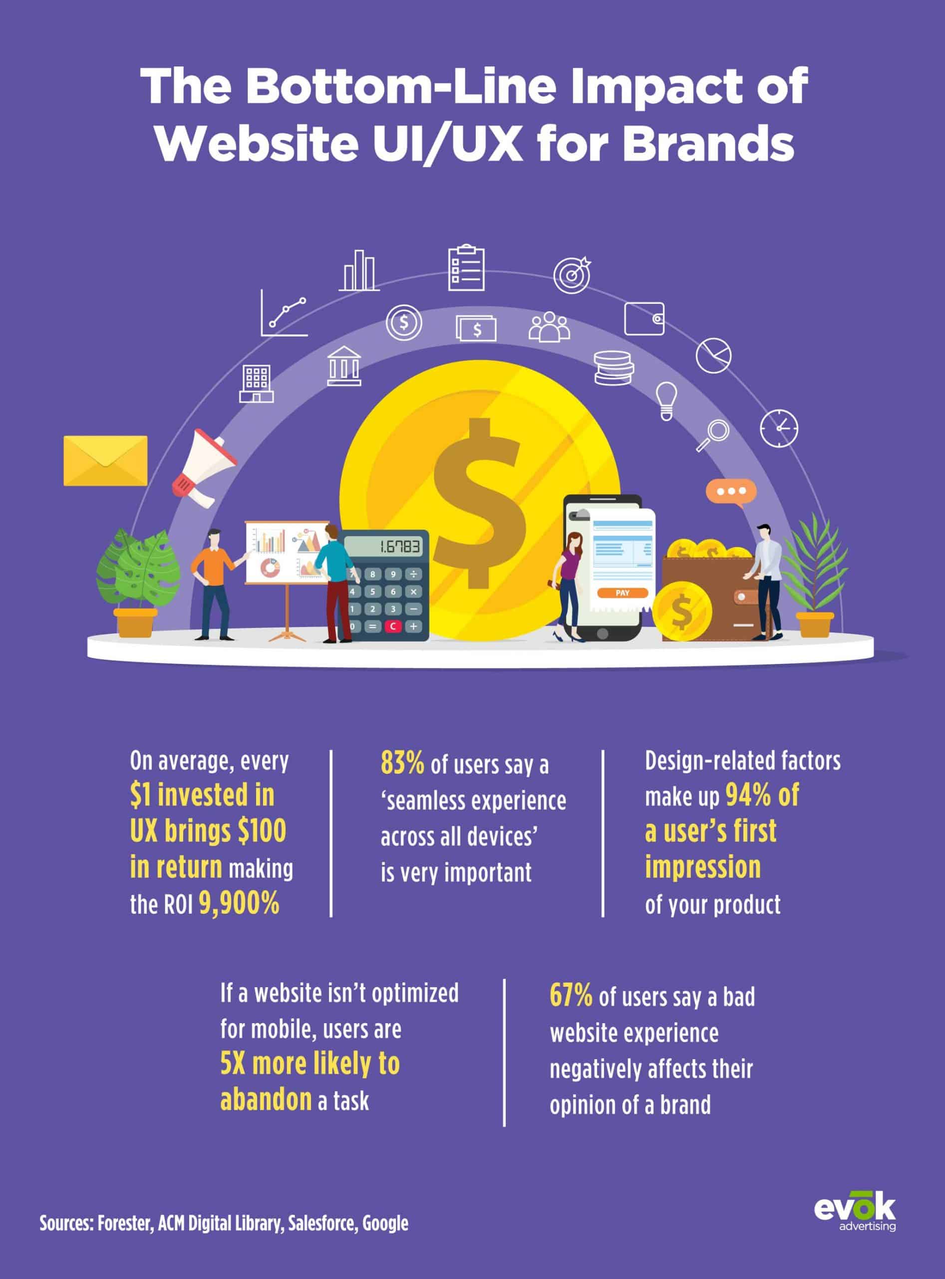
“When designing a website, evok recommends starting with a list of must-haves, a mood board, brand color palette and creating wireframes before moving into the design portion. Keeping the website design clean and simple is important from a navigational standpoint and for the mobile experience. Often, less is more.”
Cheryl Parker, Director of Client Services at evok advertising
Launching an entirely new website is a significant investment. However, you don’t always need to start from the ground up to bring your website design to the modern-day. Bold typography, creating new header graphics, and streamlining colors can go a long way and elongate the life of your existing site. At the same time, ADA compliance and mobile-friendliness remain top priorities and should be first on your list when it comes to your institution’s website.